2014-05-13
BRUSSELS - “As deputy editor of a cross-media team, you have to be editor, programmer and designer all at the same time,” says New York Times interactive news editor Tyson Evans during his keynote at the Dataharvest+ conference in Brussels.
“The intersection between technology, design and journalism is hard to find,” Evans states, “but most of the time we succeed in telling the right story, constructed in the right way and in the right format”. In order to do that what you need most is strong team members from all fields and domains. “Our team consists of about thirty creative minds with divers backgrounds—from reporters to engineers and geeks”. Together with the other news teams they make interactive stories about big news events like the Oscars or the Superbowl, and dig-deep investigative journalism using data or crowdsourcing.>
Whimsy
“Whimsy side projects,” is what Tyson Evans calls the New York Times’ creative projects, “whimsy is good.” His favourites? The Twitter project @NYT4thdownbot, the projects Haiku’s and Black-out poetry, which reuse text in existing articles in a poetic way, and —one of NYT’s big successes— the dialect quiz. “Most of these side projects are really nerdy and have sprouted from nothing but my colleague’s passion.”
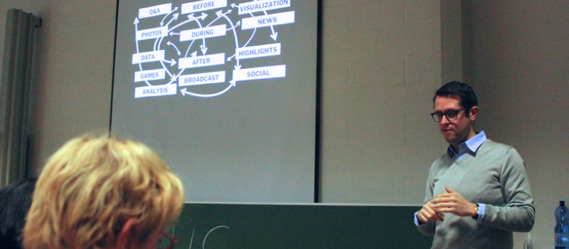
Design Process
In Evans’ view, the ideal design process consists of seven steps. “Brainstorm, improvise, prototype, refine, test, measure, repeat.” ‘Repeat’ and ‘remix’ are two words Evans uses throughout his speech. He is convinced that just about everything on the market is a remix of a much older idea. The current iPad doesn’t look that different from a first prototype of a digital newspaper reader from 1994. And the very first Google Streetview was developed no less than 33 years ago by MIT.
The New York Times does not itself shy away from taking a good idea and remixing it either. For example: a gamer played the same race game 1,000 times, made a video of all those games and stacked all those video layers into one single video. Evan’s team used that video as an inspiration for a series of images that NYT shot in Sochi. But also formats created internally are being refined and reused. At the Vancouver Olympics of 2010 Amanda Cox decided to portray the finish times not visually but auditorily, to emphasise the often extremely minimal differences. “During the London Olympics, we made a video along the same lines,” Evans says. “And we recycled the idea again for the last Winter Olympics, only with pictures this time.” One of the most important requirements to reuse ideas from inside or outside your organisation, according to Evans, is a healthy dose of self-criticism.
Can? Or Have To?
“There are many things a newsroom can do,” Evans continues, “and there are a few it absolutely has to do. It is where those two meet that we create added value for our readers”. Without lacking in self-criticism, Evans chronologically runs a few of NYT’s interactive projects by the present journalists. He starts with the Vancouver Winter Olympics—his first Olympics. The team created a number of separate web pages that dealt with the enormous amount of data at the Olympics in an innovative way.
Looking back at that first big interactive project four years later, Evans sees more than just a few growing pains. “The direct newsworthiness of the data visualisation pages was nonexistent. The visualisations were in no way integrated into or linked to the news events they were about.” The result: little traffic and a flawed reader experience. The team tried again with the London Olympics but did not find the optimal focus then either. But third time is the charm and for the Sochi Winter Olympics they brought the data visualisations right into the accompanying articles, in between or next to the paragraphs. They also experimented with new media that they picked up from more commercial channels, such as a 360° view from atop the ski jump, or photomontages of complex figure skating and ski moves
Four example articles during the Sochi Olympics:
- Data, image and text together in an analysis of the slalom gold medal.
- A 360° view from atop the ski jump.
- Photomontages of complex figure skating and ski moves or jumps.
- The odometer, a compilation of data that was updated in real-time during the Winter Olympics.
Evolving Reader Experience
Experimenting with news can be a tight rope to walk, confides Evans. “As a news platform you want to foster trust among your readers,” he says, “but sometimes you have to go with the flow of the moment and with the knowledge and drive of your team”. Furthermore, the fast-moving developments on the technological market could put pressure on the bond of trust between a news platform and its readers. “We can’t predict when the new smartphone, iPad or operating system will be launched and what their influence will be on the user-friendliness of our stories.”
The editor has witnessed the perception of news change in a lot of different ways of late. “Readers expect a news platform to offer more than just information. A few years ago the need for data driven journalism started to grow. Readers wanted raw data to be accessible and even wanted to be able to process it. Shortly after we witnessed a boost of hyperlocal journalism. The past six months a quiz frenzy started. Here, again, we see a renaissance of old techniques and new channels.”
Evans believes technological evolution results in a race between what the reader wants, what the team can offer and what is relevant for the story. “There are times when you doubt yourself or what you’re doing,” he admits. “Is your concept too advanced for your readers? Or, on the contrary, are they so far on in the digital world that your idea comes across as clumsy and outdated? Just when you have mastered a new storytelling technique, a new device or software is introduced.”
By Anneleen Ophoff
Translation by Rafael Njotea